Final
Evaluation Ellie Fisher
Through the aspects of managing my time throughout the
project, I believe that I have developed progression through the past projects
to adapt the skills I have learnt to achieve a planned well organised final
major project. For my sketchbook time management was planned efficiently
through the aspects of completing 4 sketchbooks including 1 A3 book. Within the
sketchbooks I managed my time through completing a set amount of pages within
my independent study and the weekend availability. The sketchbooks were
generated outside the lesson which I believed to work effectively because I
could plan my time efficiently to the textiles workshop that was on available
at certain aspects due to health and safety rules. Through the planning of time
to my sketchbook through my independent study it has allowed me to plan
efficiently in order to complete the highest standard including aspects of
Textiles and fine art combined within the surface. To support my time
efficiently, I used my project proposal sheet to guide and follow the set weeks
initially planned. Also, through my time management sheets it has allowed me to
plan my time within my independent study to create the pages in which I wanted
to achieve. It has given set times, targets for what I am aiming to produce and
the reflection in which I have achieved from each day. Throughout the project
weeks I gave time every day to my sketchbook work and balanced the time
efficiently with studio aspects and Textiles availability. Also, I have use my
diary to plan my time efficiently to suit the requirements of the project,
completing elements and balancing my time effectively to work alongside studio
availability and elements outside of the college environment including work.
The time management has allowed me to develop and plan my time efficiently
which was a problem faced before the project. I have set targets and decided to
give me the availability to move on from pages with the tasks I was aiming to
produce each day. Through the determination of completing sketchbook pages and
my A3 initial piece it has given me the confidence to progress and expand my
knowledge further to another A4 sketchbook. From the organised time and
progression I have produced further sketchbooks including 2 A4 surfaces
exploring the aspects of my Textiles sampling, organisation and planning and
production towards my final outcome. Through organising my time I have decided
to annotate my pages in large stages as it allowed me to progress and maintain
a rhythm of key words and aspects of studies connecting together. Through the
large scale amounts of annotation it has allowed me to progress and plan my
time to capture the final pages which was an element in which I have gained
through the previous project. To improve the aspect of managing my time for the
sketchbook I would change my time planning for the annotation of my technical
file. As the technical file was produced and annotated at the last week of the
project I felt that I was unable to achieve accurate outcomes and analysis of
the design. But the problem was resolved and each technical file was generated
well to an excellent standard. Also to improve my time with my sketchbook I
would change the time in which I produced my final timeline sketchbook as I
found it difficult to work back into the surface. To resolve the problem I
would of annotated the sketchbook to the time in which I completed the
progression which would of achieved a further detailed design. For my Final Major Project, focus I decided
to select my theme through looking back into my family history and the
environment around me. At first I struggled to think of a theme as we have been
previously given tasks and I have developed them to suit my own style and
expansion. Also, I found this aspect challenging because I am known to be
working better to live briefs and restraints to adapt my style and passion for
Textiles. To select my theme I decided to connect the element towards my visit
to New York City with college as I could obtain a various amount of research
from visits to tourist attractions, iconic areas and landscapes. This sparked
inspiration as the city is known for the large scale of industry aspects and is
known for the symbolism of the American Dream. The symbol of industry was
inspired by the iconic landmarks of New York City including the Empire State
Building and Rockefeller Centre. The 1920s aspect of the city was inspirational
when generating ideas as it followed the economic boom and how America had a
massive impact with the industrial development. To combine this aspect of my
visit to New York and the theme of industry, It gave me the inspiration to look
towards the local industry well around the city of Barnsley. Through the town
of Barnsley it is known as an industrial environment as it was built around
coal-mining and working class society. This was inspired from my family as I
have been surrounded by the historical aspects of past generations working within
the coal-industry, including my Uncle and Grandad. This was inspirational as it
was a strong passionate subject within the family and community which would
allow me to gain a large amount of research and opinions. From this knowledge of
local industry it has allowed me to obtain my routes as I have family history
miner’s works who have been involved in the 1984 strike movement. I am proud of
my family history and the working class background which was a main reason to
select my theme. Through the subject matter of industry it has allowed me to
expand two aspects of global and local industry with comparison and contrasting
elements. Through selecting my theme I struggled to capture aspects of artist
research which was a problem I faced within the stage. To solve the problem I
worked back into the sense of local industry and the elements of justice and
campaigning. As I have previously shown interest for the topic through my
passion of campaign artwork and protecting the environment I wanted to expand
this aspect further to suit the subject matter. As my family history were
involved through the 1984 strike movement it gave me inspiration to reinforce
this subject matter and combine topics together to create a final theme. As the
miners’ strike had an enormous impact around the community town I wanted to
achieve the sense of support, pride and reassurance felt around families. To
incorporate the sense of Justice around global industry I decided to reinforce
this through current topic issues within the news which includes the new
leadership and presidency of the USA. Through the selected theme I wanted to
express the sense of the “American Dream” and the freedom that the city is
famous for displaying. Both aspects of these themes were maintained through the
project towards my research stage of the project. For my research stage I
visited the city of New York to obtain primary sources. The research included
photographs taken from different aspects of the city to show diversity and the
sense of wealth and division within the landscape of the city. I collected
imagery from the New York Skyline and Central Park to capture the subject
matter of justice well. Furthermore this subject matter was captured through
artwork displayed across the city and graffiti showing expression and justice
in a creative way. The visit was also very useful as I was involved in a
protest which gave me the knowledge and experience to visit the environment.
Through my visit and exploration of the city I captured the rich and wealthy
areas including Empire State Building, Rockefeller Centre, Grand Central Station
and Times Square. To capture the subject matter of freedom, I captured imagery
taken from the Freedom Tower, Statue of Liberty and Times Square. I captured
the different aspects of the environment through photography and documenting my
visit at each day through a personal journal. Through the primary studies I
have captured, observational drawings when exploring the city which expanded my
sources further. Through the trip, I visited the MoMA gallery which has been
inspirational as it has allowed me to gain artist studies and inspiration from
the works of Andy Warhol and exploration decades of art which faced political
movements including the 1960s. It has allowed me to gain inspiration from an
artist’s perspective and to see forms of justice presented in a different aspect.
For my primary research to Local Industry I visited the National Coal Mining
Museum to gain photographs of studies of industrial machinery and the working
environment. I visited the Hero’s exhibition to gain inspiration around the
miners’ strike and how contributed to the efforts and support. Through the
coal-mining museum I have captured the campaign artwork and method in which was
used for supporting the movement and fighting against the government and the
changed within society. To gain further inspiration, I have captured the sense
of Protest artwork gained from the exhibition “Protest Lab” displayed in
Sheffield. This research was inspirational as it gave me the inspiration and
drive to achieve protest artwork following the topic of the miners’ strike.
Within my visit to the Millennium Gallery in Sheffield, I have explored the
subject matter of local industry through the steel industry and a permanent
exhibition called “Steel Works” this was less useful because I found the subject
matter less inspiring as too many objects were on display causing the display
of it being overwhelming. Through my visit to Sheffield, I have also captured
primary sources of Grayson Perry’s tapestry study of “Comfort Blanket” which
allowed me to create and analyse the study of the artwork in person. For my
primary research I have also captured photographs taken from the Barnsley
Museum specifically researching and developing towards elements contributing
the iconic industrial town. It allowed me to gain further information around
the coal-mining industry but also learn about other industrial aspects that
contribute to the town well. Finally for my primary research I achieved further
artist development and understanding through the works of Andy Warhol “artist
room” in Manchester. The gallery visit allowed me to gain an insight towards
how Andy Warhol presented the American Society within a negative way compared
to the contrasting positive aspects commonly known. For my artist studies I
captured campaign artists within different decades exploring subject matters
within the time. For example Keith Haring was captured as he was an iconic New
York artist in which displayed his works across the city. He captured subject
matters faced and campaigned to fight against HIV. As previously mentioned Andy
Warhol has been captured to explore two contrasting subject matters of New York
showing positivity and negative aspects of the American Society. To capture
campaign artwork I explored the political and post war artist Peter Kennard who
captured Anti-war imagery and maintaining a positive within the dark imagery
and symbols of death. To capture the
studies of my pathway of Textiles, I decided to follow the artists of Grayson
Perry and Tracy Emin. Tracy Emins work has been influential as the artist
explores current and universal subject matters through the form of angry
expression. She captures the sense of expression and the feminist aspects to
change the outcome to a different meaning and also contrast the stereotypical
role presented. Tracy Emin supports my studies through tapestry works as it
connects to the similar designs and expression shown from the miners’ strike.
The workers union banners were a main expression and form within the campaign
work and the works of the contemporary artist were similar with the same
subject matter and layout. Compared to
other artists generated, it captured to the aspect of my theme better and
linked to the industry and unions directly to suggest messages and inform
others. The works of Grayson Perry were also inspirational and supportive as
the reinforced idea of tapestry works were captured and explored through
universal subject matters. Through my project proposal Grayson Perry was the
leading inspirational artist towards capturing my theme because I previously
watched a series of documentaries capturing tapestry works and the working
class society. Through the artist he has followed the same subject of matter of
the mining community and progressed to create a workers union banner. Through
the banner it has been influential and has captured my determination to follow
the similar research matter. It gave the sense of reassurance and community
spirit when collected throughout the documentary. For the works of Tracy Emin, I
decided to capture critical study of her works through the exploration of
textiles and embroidery. The surface captured layers of patchwork and
embroidery pieces well to show my understanding and the style in which the
artist created. To present the study of texture, the pieces were developed with
recycled and embroidered into the surface well. To show the repetition of
colour and form repeated fabrics and surfaces were displayed to capture the
sense of irregular rhythm and movement within the piece. To present further
repetition and texture embroidered pieces were placed onto the surface including
traditional crafts of buttons and finishes of pearls. To reinforce the striking
lines of capital letters they were expressed through the flowered fabrics and
similar surfaces demonstrated within the study. For the use of colour scheme
the continuous scheme of feminist colours were captured to reinforce the
subject matter and understanding of the piece. A simple, repeated running sketch
was used to capture the patchwork pattern. The forms and square patchwork
shapes were maintained throughout the study to create the sense of traditional
crafts. The scale and form of the design has been reinforced throughout the
study to show the striking lettering and fonts that suggests the message of
anger and emotion through expression. The composition of the outline continued
to be unorganised to capture the striking piece and display well. For the
studies of Grayson Perry the pieces have been separated into the two different
choices of media capturing his ceramic and textiles pieces. For the studies of
the ceramic works I have captured the depth of textured lines through the
process of Batik which connects to the Textiles aspects of my pathway and the
further understanding of the artist’s work. As the cermanic works were textured
and embossed within the surface this aspect was generated through my studies to
emphasise my understanding and progression. The rhythm and cotniuous movement
of colour within the pieces have been generated well through the choice of inks
and watercolours throughout the piece. To show my understanding of the
repeated, striking choice of text and graffito designs the choice of stamps
were maintained to capture Grayson Perry’s monologue work and dark subject
matters. The textured, detailed pattern surfaces have been developed well
through the choice of fabric and embroidery within the design surface to show
the conflicting messages and meanings behind his work. The strong silhouette
designs have been maintained through the studies to capture the intricate
details within and the subject matter of fonts and surface patterns. A strong
maintained display of harmony has been presented well within the surface as the
continuous lines and rhythm have displayed the moving images and emotional
subject matters through Grayson Perrys work and perspectives. The overall piece
demonstrates the sense of harmony well and captures the similar subject matters
that are not commonly used or said within the art perspective. The piece
displays the diverse striking colours but also maintains the similar intricate
details used to capture the piece. To raise the surface to show my
understanding of the ceramic pieces textured fabric has bordered the designs to
show a textured surface but also maintaining the regular colour scheme
generated. For my second critical sheet I wanted to capture the striking
characteristics and forms in which highlight the working class society subjects
and the sense of division between the nations. To capture the harmonious
colours of the royal landscape displayed within the tapestry piece, textured
layers were created in order to fit the design well and demonstrate the similar
material generated to reinforce my understanding of the piece well. This
captured the sense of rhythm and harmony from the landscape and gave me the
opportunity to create intricate foreground surfaces. For the surface design,
embroidered pieces were stitched into the design capturing the strong fonts and
information well. The piece reinforced the understanding of the materials
generated form observational studies and captured the skills in which I have
specialised. Through the study the strong repetition of lines were used to
capture the surface design well and the striking colour scheme taken from the miners’
strike directly. This was exposed and reinforced into the background of the
design generating a sense of a secure repetition and pattern surface. The form
of the characteristics were important within the design surface and this was
captured through a large scale proportion and scale of the studies. As the
monotone, industrial colours were on display through the studies this was
captured through the ink and pencils to symbolise the death of industry and
support in which the community faced. The critical study sheet was concluded
with a large scale drawing of a political figure avoiding taxes which was
striking within the surface and the depth of line captured the fear and emotion
of being caught my the angry dogs. The choice of striking red was created to
symbolise the emotions felt within the working class society. To conclude the
design, the detailed forms of embroidery were placed onto the surface well to
show movement and suggestion of harmony working well with other aspects of the
design being captured effectively. For the critical study of Peter Kennard, the
surface design was captured through a depth understanding of colour and
movement displayed throughout his work. The sense of rhythm and movement
captured the monotone colours well as it demonstrated the continuous theme
running through his world. The striking form and shapes of the font were
captured well within the surface as it generated the messages that the artist
wanted to achieve about anti-war outlooks. The strong monotone colours blended
well into the background and captured the messages well. To highlight the sense
of 3d forms and texture that the artist has developed, it was placed onto the
surface well with bringing the critical sheet forward within the layout of the rhythmed
and continuous patterned designs. The choice of Gouache and Acrylic paints
brought a sense of detail within the design capturing the aspect of life with
the environmental colours of the earth including yellow and green. For my Keith
Haring studies I have produced a series of lino-cuts capturing the simplistic
lines and silhouettes of characters. For the design aspect it emphasises the continuous
lines being generated to capture subject matters but also emphasising certain
elements of the design. Through the lino cuts it has captured the depth of line
and texture generated from the studies and skills I have learnt. For the colour
scheme they were maintained simple which was learnt from the studies to present
the detail depth of line well. For the lino cuts black and red were used to highlight
the emotions felt during the design surface and the period of time in which
they were created. It has captured the sense and style of graffiti which was
placed within the city of New York. For my secondary research of designs I re-watched
the Grayson Perry documentary to gain and learn about the inspiration in which
he achieved to create his works. It was inspirational as it allowed me to gain
influence to an artist who followed the same subject matter and displayed the
same opinion as me. Also through my secondary research a Pinterest board was
produced which gained my sources of photographs taken from the miners’ strike
which was developed and adapted into research sheets. Through my bibliography I
have obtained secondary research sources from artist books and gallery studies
which connect to my critical studies well. It has allowed me to achieve
accurate sources through library books well and to progress with my research
and initial inspiration ideas for the project theme. This included looking into
the movement of Punk which was a rebellious movement showing justice within a
musical perspective and artist way from album covers. I enjoyed researching
this information as it connected to my passion for music and genres within my
hobbies. My research was developed throughout my sketchbooks to show
understanding of the information and studies achieved. The studies were
developed to fine art studies and included my own development and
interpretation of the theme well. Also it captured Textiles perspectives well
within my development including adapting my designs to suit my specialising
including embroidery and experimenting with fabrics. Through all research
perspective they were adapted and suited to fit my style and perspectives which
made all of my sketchbooks unique and individual. Also to include the large
scale amount of designs they were collaged well into my sketchbook and designed
into the surface to create background pages and scenery. This was especially a
recurring theme within my New York pages. The developed research were also
expanded and placed onto my blogs for analysing which specifically included the
gallery visits and exhibitions. From my research it was also developed into my
research sheets to provide the understanding of two aspects of my theme in
which I wanted to achieve and progress further within the project. The division
of both themes allowed me to adapt and develop my research to suit the
requirements and two areas that I wanted to explore with depth analysis with
the support of justice and campaign works. To progress further into my design
development and the visual sheet stage I continued to complete surface pattern
designs exploring the separate themes. This would allow me to identify and
finalise the piece and subject matter I was wanting to produce within the
Textiles studio. Through the visual sheet I wanted to incorporate my detailed
research and an areas in which inspired me through artists influence and
inspiration. For the New York research I was taken inspiration from the modern
industrial aspects including buildings and iconic attractions that summarise
the New York skyline. For the landscape perspective I was influenced from my
studies taken from the Liberty Island and seeing the city through a horizontal
perspective. Within the design stage I took forward the subject matter of the
“American” dream which was inspirational and brought the connection of campaign
and the sense of freedom well. As the city was proud of being an American state
with the aspects of industry this influenced me to produce the visual sheet
with an outline of the American flag with elements of the reassured display of
support towards the nation. The design of the American flag was influenced by
the recurring image being displayed across the city through my primary
research. Another area in which I found inspiring was the traditional aspect of
the city and how it was formed during the 1920s taken from imagery of the empire
state building and Rockefeller centre. The piece within the visual sheet was
influenced by the progression of creating the landscape and the industrial and
equipment tools being suspended and connecting steelworks together. Another
inspiration in which was influenced towards the project was the description of
freedom across the city which has been analysed into typography giving the
suggestion of describing the American dream and New York society. The elements
of the advertisements and the New York night life has been progressed further
and has been inspiring to create the design outcome. The subject matter of
freedom has been developed through my visual sheet as the Statue of Liberty
concluded and summarised what the city has been named and known for across the
world. As the development and progression towards global industry it was difficult
to specialise the outcome to one aspect as different elements within the
studies contribute to the subject matter and depth meaning of the city. Through
the development and influences from an artist’s perspective the works of Andy
Warhol and Keith Haring captured the illustrative outcome of my designs.
Through the advertisements and New York City description I turned to Andy
Warhol as the artist captured screen-prints showing both positive and negative aspects
of the city. It reinforced my opinion of the city and contributed to my
inspiration well. Through the American flag the symbol of nationality and unity
was also inspired by the works of Grayson Perry and Tracy Emin. To capture the
local industry through my design process the visual sheet was more specialised
compared to the aspects of global industry with a running theme that connected
together well together. For the design the pieces were inspired through the
development of campaign artwork and the sense of community spirit displayed
throughout. The controversial subject matter of Orgeave and the division
between the miners and police was an inspirational aspect as it connected to my
theme of industry and justice well. Through this subject matter two surface
pattern designs were captured which was a strong maintained display of
information well. The subject matter of the miners’ strike was developed further
within the design sheet through campaign aspects with slogans and captions
taken directly from my research. This was inspirational as they were striking
and captured my aspects of Justice well within my research. These were combined
through the visual sheet designs well capturing a balance of both themes well.
The research in which informed my design process was the tapestry and union
works as they captured intricate details symbolising the community spirit and reassurance
in which they gave to the working environment. It symbolised the support in
which the miners and families gained to fight on within the community and lives
which inspired me to include this aspect with the combined artist studies of
Tracy Emin and Grayson Perry. For the taopresry studies this influenced a
design within my sheet which was a community illustration highlighting how the
industry impacted every aspects of society through the community towards the
cities. The intricate contrasting surface pattern was included within the
design. From my research I was inspired by the National Union Of Mineworkers
And the political figure Arthur Scargill to be included within the design and
development stage. Also, I was inspired by the industrial machinery and
landscapes of the coal-mining environment in which has been achieved from my
primary research towards the national coal-mining museum. It has allowed me to
include this striking forms with also the equipment used through the miners.
This reinforced the idea of my family history as pit lamps have been a symbol
of importance within the family and were used by my Grandad. From the designs
sheets and the combination of influences generated, I decided to focus with
capturing the local industry aspect as it displayed a perfect balance of my
themes well. I felt that the connection of the designs worked well and
displayed a rhythm and movement within the design connecting similar aspects of
the theme that linked together well. The global industry wasn’t expanded
further because I felt that the design didn’t show a clear design of justice
well and each individual designs were seen as opposites which didn’t show a
recurring theme and movement compared to the other aspect of the designs. The
constraints in which effected my design was the availability of sources due to
finance and money from a student’s perspective. As I was limited to my blue
card allowance I had to plan my amounts well with solving the issue through
creating miniature A4 samples within the screen-print stage. Time-management
and availability within the workshop was another constraint faced as due to
health and safety I was limited to the time available within the Textiles and
Fashion studio. This was solved through planning my time outside lessons
through my independent study to create the samples in which I wanted to
achieve. Another constraint faced was also time as I was away for 1 week during
the start of the project to travel to New York with college. However as it was
a research source it worked in my favour to gain the research I aimed to
achieve and to catch up with the work missed within the independent study. I
was constricted through time at work as I was balancing my work with my job throughout
the stage but was also solved as I completed blogs within the time slots and
availability when completing work. Constraints were displayed within the studio
as problems were faced with my screen and samples. I was limited to the amounts
provided within the studio I was restricted to the amount of puff binder,
colour mixing and devore samples in which I could achieve. Also through problems
faced within my blocked screens this restricted me to sampling and time in
which i could have been progressing and developing designs further. Through the
scale and sizes of fabric samples I was constricted to be producing large scale
experimentation samples as it would be cost effective. However through the
range of smaller samples it has allowed me to expand the diversity of colour schemes
and production to analyse a diverse range of methods and techniques. The chosen
colour schemes in some way were a form of a constraint as I had to follow a set
range of schemes to connect the work to my chosen theme of the miners strike and
allow the outcome to be engaging towards the audience. Also, through the
exposed layers of screens I was restricted to the set amount and for the pieces
to work effectively they had to be used together within the surface. The sewing
machine was a constraint within the Textiles studio because I was limited to
the amount of patterns and surfaces in which I could use well to capture the
applique style. For my experimentation and processes, I have produced a
seletion of methods and techniques within the Textiles studio including the main
project aspect of screen-printing that captured 4 layers combined together
which was the biggest amount of layers I have produced so far. Also weaving and
knitting were used to capture the traditional industrial elements to connect to
my theme but also to give me a better understanding of specific and joined
colour schemes. Batik samples were produced within the studio which allowed me
to symbolise my specific project aspect and theme of slogans from the miners’
strike and combine this element with chosen colour schemes. Also through batik I
could combine further textiles processes onto the surface which included
specific screen samples capturing graffiti style. Cotton fabric was dyed to
suit my colour scheme and developed further through printing. Devore sampling
was mixed and captured well to show the process of the fabric burning onto the
specific samples to capture the designs. Also puff binder was used to bring
raised surfaces and a sense of industrial texture to the surface. Felt making
was created to capture colour scheme well. Paper samples were generated through
my independent study capturing the experimentation of varied surfaces. Heat
transfer was used to capture information for my business cards and cvs to transfer
information well onto the surface. Sewing machine was used to capture the
method and technique of applique well to work back towards my designs and
progress the skill further towards my final project. Outside of the Textiles
studio, lino-cuts were generated to capture Keith Harings work. Problem Solving
has been encountered throughout the project which has allowed me to resolve the
issues. Firstly when generating my project proposal as I unsure how to capture
artist studies towards the aspect of local industry. This problem allowed me to
progress and capture my theme of justice and campaign within the design. This
led me to achieve inspiration from the artists Grayson Perry and Tracy Emin. My
Pinterest board also contributed to this well and captured further knowledge of
artists including the discovery of Peter Kennard. The problem faced during the
research process was the time in which I visited galleries and I visited two
gallery exhibitions that were closed in Sheffield on Monday. To solve the issue
my time was planned and checked in order to visit the gallery. Through the
development process of my visual sheets I struggled to capture inspiration for
the layouts of my designs. The problem was solved when looking back through my
research to achieve the outlines that worked well. The textiles studio faced
various problems within my development stage. The exposure machine was an
encounter because I was struggling to capture accurate measurements for my
layers to work well together. Through magic tape and tracings this guided the problem
and my designs were exposed further through darker layers being produced with
the permanent pen and lightbox. Then the screens would expose well causing
blocked and damaged screens which was repeated through the same process to
achieve the effective outcome. Also as the screens were being used exposed
areas appeared which were covered with newsprint when completing the print stage.
Through the textiles studio the colour black ran out which has maintained a
faded appearance within the final outcome. Through my fourth layer of the
screen the puff binder surface didn’t work well as it covered the writing and
damaged the overall appearance. During the process this design was removed. When
working into the sewing machine the design caused creases which were a problem as
it effect the overall developed layered outcome. When placing the applique
design onto the surface this caused a problem because the fabric would move
causing the stitching to be placed onto the wrong areas. When completing the
layout of the final design a problem was faced with measurements but was
resolved when tracings were used to guide the design. My problem solving
towards my final piece was reflected through my progression timeline capturing
all the minor issues raised and solved. The problem solving was also captured through
my blogs and my sketchbook with the analysis of diverse range of sources. Problem
solving was maintained through my time-management diaries and reflection. If I had
no time constraints within the project I wouldn’t change my final outcome but I
would expand on this to create a print following my global industry research as
I felt the visual designs had a large amount of potential. Also I would develop
the aspect of my final piece further through further textured pieces of
embroidery and the use of the sewing machine. If there was no time constraints I
would have expanded my piece and generated further series of samples through
the exploration of materials compared to be maintained element of calico. For
the final piece design it was previously problem solved as I was finding the
screen print samples onto calico too simple and doesn’t express intricate
surfaces. To solve the problem I worked back into my sketchbook and gained inspiration
from the works of Grayson Perry and Tracy Emin. As both artist use tapestry
pieces they were easily compared through similarities and were the main inspiration
for the piece. Both artists displayed Textiles imagery and the patchwork displays
of national flag. This was inspirational as it allowed me to adapt the aspect
to suit my work and the reassured pattern of national identity and community spirit
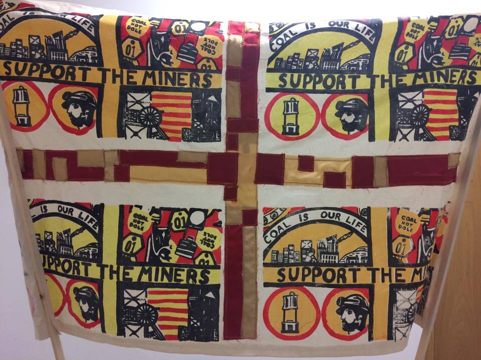
previously created within my screen. The applique design was applied to the
surface with the colours of red and satin to maintain my colour scheme. This was
placed onto the surface well and divided the piece to create a banner flag. The
outcome was also produced within a previous sample to solve the issues raised
before being completed on the aspect. The final design captured both of these
aspects well and demonstrated a sense of balance within the final surface. To conclude
the design two wooden poles were connected onto the sides to capture the banner
appearance. What went well with the design what that it was a clean and neat
outcome with all the exposed areas covered and planned within the process. As tracings
were used for guidance it provided an accurate display of layers onto the
calico surface that was taped down effectively. However if I was to improve the
design I would cover the faded areas of a particular screen as it was less effective
and didn’t stand out well compared to over screens generated. Due to the loss
of black dye I was unable to fix the design which would be the area in which I would
improve. The applique design surface worked well it maintained an accurate
length and guidance with the 8cm width. To improve the design I would change
the satin fabric as It was challenging to achieve within the design causing to move
when fed through the sewing machine. For the banner pole it worked well as it
looked like a traditional piece that was displayed in marches perfectly. To improve
the design I would change the width of the poles so that the piece would stand
more accurately and free-handed. From the aspect of the project I believe that I
have managed my time effectively gained the skills learnt from previous project
which was an issue raised in evaluations. I felt that the time-management sheets
provided guidance and support to keep on track with each stage of the task with
the support also given from my project proposal. It was important for me to
stay on track and it gave me the guidance and reassurance that I would be able
to project large mass amounts within the given time scale. The organisation of
my time allowed me to plan excess to the workshop availability to suit my time
and work around the idenpendtn areas. I allowed myself to be organised and come
to college within the extra hours on Mondays and Fridays outside of my timetable
which I believed contributed the most. The majority of the time I have given
tasks at each stage of the project which allowed me to achieve them through my
diary and time management sheets. The time and management skill I believe has
been achieved and this will be reflected through the next stage of my career. Throughout
the project my blogs have been used thoroughly to capture daily records and to
allow myself to set tasks and reflection within the concluding paragraph. I believe
through this project my blogs have become more detailed to capture the aspect
of problem solving and planning well. It has allowed me to reflect the skills I
have learnt and what I am going to produce next to achieve and aspire. Through
the blogs in the project I have included further details that included gallery
visits a play reviews. This made the outcome more creative and I have
experimented with videos within my design. With this sense of reflection, I believe
that I have managed my time well and handle the pressure of the FMP deadline well
compared to past projects. I feel like I have managed my time well because I have
enjoyed the chosen topic and my individual exploration of the theme. The organisation
have been developed rapidly through this project and I am extremely pleased
with the outcome and journey I have progressed. I wouldn’t change the project
if I had to do it again because I have enjoyed capturing both aspects of industry
well with my passion for campaign artwork. i am extremely satisfied with the project
develop as I have learnt new skills and adapted them to suit the roles of the
local industry artwork. The strengths of the project have been captured through
my passion for surface design and it has reflected in which I have gained in
the past year of college specialising in Textiles. It has identified me as a
person who is striving within the Textiles environment and I am looking forward
to gaining new skills in the next step of university life. The aim of the
project was to discover the importance of the local industry in which my family
played a significant role within which reinforces my conclusion that I have shown
respect for the coal-mining, industrial town of Barnsley.


