Thursday, 11 May 2017

Artist Statement Of My Final Piece


“I want to see every single miner on strike on the picket line. If that means you get arrested, you’ll have to accept the consequences. Were in this to the finish”. – Arthur Scargill

“Coal Is Our Life” the words of reassurance and drive for the mining spirit and community faced by harsh and difficult times in the Miners’ Strike between 1984-1985. My final piece explores the importance in which the industry had in the local community but also the fight the miners faced to achieve justice and to stop the government damaging lives. The project explores combination of Justice and Industry which gave me the drive and inspiration to follow the subject matter of the Miners’ Strike. As I am surrounded by the mining community and the industrial coal-mining environment I was inspired significantly to explore the aspect of the topic through visits to the National Coal-Mining Museum and Experience Barnsley Museum and exhibition. The topic is a personal subject matter because my family were affected by the impact of the closure of the pits but also were involved in the strike movement as they supported each other in difficult times. Also, the personal topic has been reinforced through the event that was called “The Battle Of Orgreave” in which is still a running campaign today to achieve the truth and justice in which the miners faced during the conflict with the police and government.  These areas were the main influence towards the project as I wanted to achieve the expression, emotion and struggle in which my family but also the surrounding mining town felt. I wanted to capture the historic event through a sign of respect to the miners and families but also to inform the next generation how the event impacted lives and the importance of remembrance.

To support the subject matter the works of Grayson Perry was the most influential artist through the study of tapestries and textiles banners. Specifically, through my research, a documentary was inspiring to watch created by Grayson Perry which explored the role of men in the working class society and the mining community. The final outcome of the piece was a tapestry piece that demonstrated the sense of pride and expressed the sense of reassurance that the community wanted to hear. This connected to the previous studies of workers union of the mining banners which were placed in the heart of the community to support the beliefs they felt and strive they have to succeed and fight. The studies of Grayson Perry has been very significant towards the chosen outline of my work as I have created a tapestry work with layered textures and the sense of individuality with illustrations. The expression of fight has been emphasised through the choice .The work has been connected and also been influenced by the works of Tracy Emin. Through my critical study I have learnt that the contemporary artist has expressed her opinion through the choice of explicit words, symbols with the chosen materials fabric and embroidery. From observing her works, I noticed the sense of pride and national identity through symbolic flag outlines. This gave the impression of symbolism and the impression of pride which was contributed significantly through my works. These two artists combined have shaped the appearance of my work and gave me the specific inspiration to capture the final tapestry outlook.

My intentions of the project was to create a layered screen print which expressed the banner style and tapestry works achieved from combined research. Recently I have discovered my passion of Textiles through the process of surface design and printed Textiles. For the outcome I have produced 3 layered screen which incorporated harmonious colour scheme which captures the attention of the strike movement well. I have explored further techniques within the production of my final piece which includes Puff Binder, Devore, Knitting and weaving to achieve textures appearances and outcomes. Textiles has always been an interest for me as I have previously created craft and embroidered pieces. The analysis of patterned surfaces and skills achieved within this subject has been adapted to suit the style of campaign and justice artwork. The precise and intricate style I have developed through my progression in art has been captured and worked well through the design process and outlines of surface design. I have achieved a range of skills through studying Textiles and this included the use of the sewing machine. This piece of equipment has been used within the final outcome to create a Tracey Emin and Grayson Perry styled patchwork layout. The design layout has been captured through textured layers of the sewing machine and the technique called applique which reveals a final outcome of the flag outline. The textiles piece gives the sense of handmade and a personal touch towards the design. For the project I wanted to demonstrate and highlight the importance in which Textiles has given me to succeed and progress further into the next steps of my career. For the outcome of the piece it has captured my illustration and personal expression of the piece through the 4 layered screen transferred onto the surface design. The colours were harmonious through the surface but also highlighting the important strike movement campaign colour schemes. I was influenced by the choice of colour throughout my research and development. I felt it engaged the audience well with the important messages and outline. I have captured and divided the design into 4 sections which present individual meaning but are also connected together to support the concern and subject matter of protecting the community and remembering the miners fight and spirit. In conclusion the intension of the project is to inform the audience the importance of local industry in the mining town of Barnsley and how the community fought to protect and maintain the living society. The piece is to symbolise how we need to remember the importance of the event and how the coal-mining industry was protected by the community. It is vital to remember the battle of each individual miner faced and how the divide between the mining community and the government impacted the lives but also brought people together. The outlook of the piece is to summarise the Miners’ Strike in both positive and negative aspects as the event brought the pride of the mining town and the sense of unity to support each other.

The audience for the piece is aimed at both aspects of the older and younger generation. As it will be exhibited at the College, the local community will be visiting which reflects the mining town of Barnsley. I have aimed the piece towards the community aspects and I am wanting to capture the symbol of respect for the city and mining history. This is reflected through my decision not to use explicit words and the choice of imagery to capture different aspects of the Strike Movement. I am wanting the piece to be aimed at the generation who were involved in the miners’ strike to bring back memories and to reinforce the support in which the community still has in spirit today. As the subject and topic has been inspired by my personal history I am aiming the knowledge I have gain to be passed onto other families who faced the same problems within the time. The piece is aimed at generation who were involved within the strike to show a mark of respect but also to show that the work they did has been remembered and shown as a historic mark of justice. Also, I am aiming the piece to capture the younger generation to allow them to understand the impact in which the community felt but also to learn more about the mining industry. I am hoping for the piece to engage the audience and interact with the space as it will be placed as a banner with two poles with a marching crowd within the background. The final outcome is aimed to be interactive but also to reinforce the subject matter of support and reassurance that is still maintained today. The audience will see the piece in both positive and negative ways as it gives two conflicting impressions of remembrance but also support within the Mining industry.


Sunday, 7 May 2017

Devore Sampling


Devore is the process of sampling within the Textiles studio to create screen-print samples through a different perspective. The process includes the Devore' paste being transferred onto the surface of the design through the chosen screen onto specialised fabric for the process to work. The task and method has allowed me to work independently within the Textiles studio to produce the range of sampling with my chosen screen. Also the task has allowed me to plan, prepare and organise for the task with carefully selected fabric and purchasing them through my blue card. The task has allowed me to problem solve and resolve solutions when creating the samples in previous project but also the current project outcome. It has allowed me to demonstrate practical skills to produce further sampling within my technical file and progression towards my final piece. It has allowed me to evaluate my samples and understanding of the process to develop a final solution and progression towards my final piece. It has given me the confidence to experiment with the process and develop a further understanding through adding more elements within the design including dyes and a range of fabrics.


To start the task, I planned and prepared for my chosen fabric which has been organised within my sketchbook and blue card availability. The samples of materials included:


Devore Satin


Devore silk viscose


Devore Velvet


All the samples obtained were A4 samples because I was restricted to the cost implications of the fabrics as they were expensive. These needed to be taken into consideration when completing the task as I am limited to the amount on my blue card for sampling. To produce the samples I organised my chosen screen to be used for the designs. I decided to use the black layer as I felt the screen outcome has the most intricate details will be featured well within the process. Also I decided to use this specific screen as I can capture each detail of the design well and surface accurately. To place the screen layer well, through the surface each individual material was taped down to the Textiles surface to allow the process to work accurately. To plan the process ahead the Devore sample was mixed before the task to ensure an accurate substance. Next the substance was placed on the surface with a squeegee and fed through the design well. To ensure the fabric appearance worked well, the squeegee process was transferred accurately onto the surface. Then the screen was removed to reveal the outcome and was left to dry naturally within the surface. Next the process was repeated on a variety of surfaces and materials to produce a diverse range of fabrics. The Satin material was difficult to read because the surface was silky causing the design to move when in the process and damaging when folded. However the process was solved when taped on the surface well. I explored the range of surfaces with different designs and was transferred onto the drying rack to dry naturally. When observing the design, the "coal not dole" piece worked well as the surface produced intricate details and the small surface designs well compared to others. As this layout as the most exposed area within the surface more details were shown better. Next the design was place underneath the heat press to reveal the burnt areas and where the chemicals have been breaking down the surface. Health and safety was maintained throughout the task to ensure the risk of burning. Hands were placed away from the surface of the iron to ensure the risk of burning. Also my hands were washed after dealing with the chemicals to ensure safety. These were maintained throughout the task when completing the process. Once the piece was created it was transferred back to the sink quickly to remove the burnt areas and give a clear design. Once the elements were washed thoroughly they were placed on the drying rack to dry naturally. Through the process problems were faced which was that I didn't reach the sink quick enough causing the fabric to stain and not achieve its full potential. This was developed and resolved as I gained confidence with the process to produce effective outcomes of the designs. When washing a piece I decided to expanded my knowledge further to create a dyed fabric Devore sample. To produce the design I used procain Scarlet and worked into the design with a paint brush. The dyes were prepared before the process in order to achieve a rapid outcome when drying. At first the piece looked least successful as the colour covered the Devore sample which wasn't seen well within the surface. To solve the issue, the sample was left to dry and I discovered that the design worked successfully presenting the layout clearly and efficiently. I was pleased with the independent develop towards this outcome and the skills I have achieved within this. The process of the sampling is presented below:

Velvet Outcomes

Heat Press Machine

Dyed Fabric Outcome Of Satin Screen Print

placed under heat press


Large Scale Samples

Devore Paste


Next I am going to place the Devore samples into my technical file to analyse and evaluate with other sampling generated.

Samples List

4th May Final Piece Development Outcome


Also, on Thursday 4th of May, I continued to complete my experimentation and layout of what I am aiming to achieve for my final project. The process included working back into my large scale piece created and analysed within my independent study. The progress has been placed into my sketchbook and also described through evaluation within it. In the textiles workshop I have experiment with the technique of applique on the sewing machine with recycled fabrics and textured surfaced onto the space provided within each 4 surfaces. From my design progression and development I have decided to create an applique patchwork surface through the design to symbolise the St Georges Flag of England. I wanted to capture the sense of pride and community spirit but also the sense of unity within industry. I wanted to capture the all aspects of the industry that has been destroyed by the government and movement so I felt the symbolisms of the flag reinforced this idea and the sense of reassurance. The piece has been planned and problem solved through the artist studies of Grayson Perry and Tracey Emin. I have achieve inspiration from the style of Grayson Perry’s tapestry work and the patchwork of textured layers and surfaces to reveal a neat and precise outcome. Also, I have achieved inspiration from Tracey Emins tapestry works and the sense of nationalism though displaying flags and outlines. Both artists have displayed the sense of pride and elements in which incorporate our society and current topics faced. I have planned adapted this subject matter to suit the topic of local industry and my understanding of the strike-movement. The textured patchworks through line and cubic shapes have been inspired from the repeated style taken from Grayson Perry’s studies and especially the “Comfort Blanket”. Also the unorganised layer and expression of anger has been influenced by the works of Tracy Emin as thought out her work the strong sense of emotion is displayed on the tapestry works. The work has continued to be textured and developed from yesterday and maintains the same stitching pattern, shapes and forms. The task has allowed me to demonstrate the range of practical methods and skills in a self-directed project through the works of the sewing machine and Textiles workshop. It has allowed me to continue to work independently within the studio to develop the skills previously gained within the sewing machine to complete the outlook of the design. The workshop task has allowed me to solve theoretical and practical problems within the sewing machine to learn and adapt the outcome to be developed further towards my project. Also, through problem solving it has allowed me to resolve problem solutions that will be developed and adapted towards the final piece and stage. It will allow me to gain the understanding and improvement to progress towards my final outlook.

To reinforce the pattern surface that I have previously used to create an equal and repeated outlook, I used pattern 2 within the sewing machine of a Husqvarna. This sewing machine was used because it was a simplistic machine in which I have gained the skills and progression from. It would ensure that I would be gaining an accurate outcome but also learn from problem-solving when using the machine as I can work independently to resolve them. To build the texture I continued to use the same fabric of red and satin to create the outcomes. Fabric scissors where used to maintain the clean edges but also to learn from the previous mistake of the paper scissors used. As the pieces where textured, there was no repeated pattern or measurements of the individual elements created. The process and fabric was cut as I went along with the process to cover areas and textured when others are placed onto the design. This was a problem when observing the outlook as the measurements of the fabrics were cut inaccurate causing a less appealing surface with the sense of an unorganised appearance of the flag theme. To progress from the problem towards my final piece, I am going to measure the designs with the same width and length in long strips of fabric. This will ensure equal lengths and width but also will allow me to cut into the fabric to experiment with the scale and width when placed onto the surface. But also learning from the layout of fabric, I am going to continue to create a textured surface and place the fabric each individual which will also maintain an equal layout. This will be guided by a measurements and a width to complete an equal length piece. This has been developed from the display surface and observation taken from the progression within the sewing machine. When completing the surface of the design, I faced a problem when working with the sewing machine as I accidently folded the fabric underneath causing a crease in fabric. This impacted the outlook as the surface wasn’t a clean finish. To resolve the problem towards my final piece, I will be ensuring that the fabric is straight when place through the machine to avoid the problem to gain an effective outlook. When sewing the elements together, I have used black thread which stood out as each individual piece. But when placed all together I believed from observing the outlook was that the unique stitches blended together and didn’t stand out within the piece. To improve from this study and to make the stiches stand out I am going to change the colour scheme and the use the contrasting fabrics I have used. This includes, using red thread on yellow satin and yellow thread on red fabric. It will highlight and emphasise the pattern designs chosen from the sewing machine. A problem I faced with the sewing machine that due to the use of the particular sewing machine it caught both aspects of the machine together causing tangle to the surface and damaging the fabric. To ensure this problem solving towards my final piece I will be checking both elements before each stage and process of design. Finally to progress towards my sewing machine I am going to maintain a regular movement and rhythm as I discovered due to speed it changed the width and space of design. To solve the problem I am going to maintain a regular rhythm to create equal outcome of surface. The red and yellow fabric will be progressed further to the final design outcome as it worked effectively within the surface of design and complimented the patchwork outcome well. Both pieces were contrasting but worked well within the surface of the design to capture the patchwork technique but also to maintain the screen-print outlook. As the screen print surface was damage due to the expose of the machine, it caused misplaced colours. However due to the patchwork outlook it has covered the areas and the problem to achieve an effective and organised piece appearance.  The outcome of the piece has allowed me to learn and develop the skills to achieve an effective appearance and confidence towards my final piece. It has given me the progression and the sense of independence to create the final piece with the problem solving resolved. It has allowed me to plan what I am going to accurate and overcome the problems that have been faced to improve my final outcome.
Textured Patchwork Design
Chosen Sewing Machine


Sewing Machine Pattern 2
Fixing the tangled Machine
 

Next I am going to progress towards my final piece and outcome. Through my independent study I have planned for the final outcome through obtaining my final chosen fabric from my visit the Range. I have obtained Satin Fabric at 1m length for £1.60 and Red Fabric taken from table set outs which were reduced to 50p and measured at 1m for 2 elements. It has allowed me to achieve a large amount of fabric just ensure enough material to be placed onto the fabric of the design through textured and layered surfaces.


Final Appearance Of Designs

Ariel appearance of design

4th May Creative Business Cards


On Thursday 4th May through my independent study I planned and prepared to complete my creative Business cards which explores the aspects of the miners’ strike and emphasises my knowledge and development of the project theme of "Industry". The creative business card has been developed from the research task, Pinterest studies and development pages to capture a final display and outcome. The piece was captured and taken from my final screen-print layer which reinforces the requirements to relate my work to the chosen project. The identical material (calico) was used to reinforce further the requirements and the connection between my development and project outlook. I decided to create a series of circular business cards to reinforce my research and development of the badges achieved from the strike movement. It highlights the importance of the campaign artwork and how the badges can be distributed from easily and manufactured. It emphasises the importance of industry and how the repeated pattern of badges and slogans are promoted which allows people to remember and gain further support. The task has allowed me to solve practical and theoretical problems when completing the business card layouts. Also, the task has allowed me to demonstrate the ability to plan, organise and produce the final business card layouts. Finally, the task has allowed me to demonstrate a range of practical skills in order to suit the design process to complete the Textile outcomes. As the creative business cards have been developed from my initial designs, it has allowed me to incorporate my career pathway of surface design and textiles efficiently. It has identified the skills I have gained through the workshop but also the connection between my progress of my final outcome and the screens I have created in order to adapt the style to create business cards.

To prepare for the task, I previously obtained a large piece of 1m cotton and transferred 50 designs onto the surface of the design. As I discovered that some of the screen prints were least successful due to in accurate measuring and display this meant I problem solved and created further designs to ensure the target required. As the piece was a non-restricted size compared to the corporate business card I was given the freedom to complete a creative card in any scale or form. As I was completing the process previously I maintained the business card to be small as I felt I wanted the pieces to be distributed easily and can be placed in wallets and bags well. The piece outlook and shape was also maintained and captured the theme of industry justice well through the form of badges shapes and outlooks. The simplicity of the design was inspirational as I could capture the textured layout efficiently and highlight the importance of the design to the miners’ strike and my development within the project. For the chosen colour scheme I decided to maintain my visual sheet and development research through a yellow background and black foreground appearance. This has allowed me to identify my analysis of experimentation the inspiration received through my developed research through artist studies and primary and secondary sources. As the warm colour of yellow is displayed, it contrasts with the dark and monotone colour black to complete and engaging piece. To plan and prepare for the fort background layer to be placed I used a ruler to measure out how many pieces could be fit onto the sheet. As I prepared for this accurate outcome of printing process this was least successful as the screen was large and difficult to move when placing the layers. To solve the problem I maintained the same method but placed the outlines close within each area to allow me to capture the required amount of 50 business cards. Also another problem I faced was that the screen included all of the design outlook which wouldn't allow me to capture the individual design required to complete the process. To overcome the problem, I placed news print over the areas in which wasn't required which could block the screen colour from coming through the design. As the screen was to produce 50 amounts it was difficult to capture as the designs would bleed and be damaged when the screen was placed across the surface. As this would create a spilt paint appearance which captures my project theme of “Justice” it would impact the surface of the design and the engaging background appearance of yellow used for the cards. As I felt personally this impacted the piece it did give a sense of individuality which does relate and sole the issue as creative business cards emphasise this subject matter perfectly. When using the black screen a problem I faced with the distribution was that it was damaging the screen and causing erosion around the outline of the design. This would impact the design if not problem solved and the solution was resolved as gum strip and newsprint protected the design outlook. To maintain the protection and the problem solving I gained and learnt, the process of transferring the design was repeated 5-10 times at different stages, washed and dried in the heat cupboard to avoid the risk of losing an effective layer from previous failed attempts. As it was a long process, the method was completed in two stages in which has been previously said within my blog entries. To speed the process but also maintain a high quality finish, a hairdryer was used in order to protect the designs and maintain the problem solving achieved from the process of transferring designs. Whilst completing the designs I faced further problems through measurements and the accuracy of transferring the layered outcomes. Due to the screen and colour choice this made the screen difficult to see the surface of the design underneath. This made some of the layers misplaced giving an inaccurate appearance. The problem effected the layout of the design because it didn’t achieve the full appearance and the original design layout causing negative space and a silhouette outlook. To resolve the issue for the developed designs further I used tracing paper for guidance which worked effectively and maintained a positive, completed layers of design. I was pleased with the outlook of the designs and were left to dry to allow me to complete the next process.

Business Card Progress
Whilst the pieces were drying I focused on my information that would be placed onto the business card. As I have progressed and developed my final outcome of the design, I planned the element in which would allow me to access information to be placed onto the screen-print samples. The planning included working back into my Textiles knowledge and workshop and it concluded that I would be using magic touch and transfer to access the transfer of fonts onto fabric surfaces. To gain access to the topic, I used word and created a series of text boxes that included 8 outlines on one A4 sheet. The process was created for 56 to plan in case of any errors or problems made whilst in production. I planned before the problems occurred to make sure I would achieve an accurate and effective appearance. To plan and achieve accurate measurements I gained the circumference of the circular pieces. As the measurement was gained, I used fabric scissors to cut out each individual piece to ensure a clean finish with no damage to the surface. This knowledge was previously gained from problem solving and cutting past fabrics with normal scissors causing damage to the design layout. As the pieces were achieved I gained the measurement of 8cm and this was reinforced and edited onto word. The measurement allow me to plan and adapt the lettering in order to fit the size. Next the documents were sent to reprographics in which I prepared and had the money to require the pieces. To ensure the magic touch paper to work, the designs were reversed on the photocopier to allow the information to be mirrored and placed effectively. Once the pieces were captured they were taken to the textiles studio. To ensure accurate measurements, I placed the pieces under the paper cutter to prepare for an equal finish and to be placed onto the surface quickly and effectively. Next the designs were placed on the heat press with the creative business cards.
Magic Paper

Health and safety was maintained throughout the heat transfer process, hands were placed away from the surface and iron to avoid the serious risk of injury. Also, hair was tied up to avoid risk of burning and college cards were placed away from machinery. To start the task the designs were placed faced down on the heat transfer with the magic touch paper. Then the heat press is placed onto the surface for 10 seconds at 120 degrees. Once the process was completed the paper was removed to reveal the outcome of the surface and transferred design. The process was repeated but problems were faced within the design process. As I placed more than one design onto the surface I couldn’t remove the paper within the time limit. To solve the problem and learn from the process I did the transfer one piece at a time to create an accurate finish. Also, another problem faced was that some screen printing dyes went through to the background of the design causing the information to be unclear within the surface. To solve the problem the information was placed onto separate calico to reveal the information clearly and then was transferred onto the back with glue. All 50 pieces were created and captured my project theme and design process. It has allowed me to plan my time efficiently and problem solve to complete the requirements.
Heat Transfer Machine
Final Outcome
Paper Transferred to surface
Heat Transfer Surface
Calico outline placed onto surface
Next I am going to complete my creative CV which will be explored and captured through the same process but also experimentation.


2nd May Development Of Final Piece


On Tuesday 2nd of May, I have progressed towards starting my final piece of the project "Industry and "Justice". The outcome has been explored developed and expanded through research, development, problem solving and experimentation of samples. The outcome highlights the inspiration and final visual sheet developed and experimented through colour scheme and sampling. I have identified the chosen materials and colour scheme which are going to be placed onto a banner which expresses the justice and support of the Strike Movement. The final chosen colour scheme has been developed from my research and experimentation which reinforces the theme of the Strike Movement and incorporates harmonious tones gained from the campaigning movement and posters. The chosen colour scheme has been split into two backgrounds to show diversity and the sense of repetition and how the repeated screen can be developed and placed onto various surfaces and can use various colour schemes within the surface of the design. For my final chosen colour scheme I have developed 3 layers that includes red, yellow and black and red, orange and black. These colours have been chosen as they express harmony and connection within the piece which will blend and complement each other well within the surface of the design. Also these colours connect significantly towards the movement well as these were expressed during the miners’ strike with the colour black symbolising the industrial material coal. Also, the colour orange suggests the equipment used through the miners hats and uniforms when working down the pit. This is also connected to the colour yellow for uniform and machinery. These have been previously explored together on a large scale piece and I was pleased with the overall outcome of the design. The varied colour scheme suggests diversity and the theme of patchwork which connects to artists studies of Tracey Emin and Grayson Perry. The piece is aiming to connect to tapestry works and I am going to develop the banner further with including the patchwork and using the technique of applique. As I have previously experimented with the combination of these elements they worked successfully within the design and created the sense of handmade style and a community spirit in which I am wanting the piece to display. I decided not to include my 4th layer of white within the design for the following reasons. As I have previously experimented with the piece through Batik I felt the textured layer didn't work well with the other coloured layers causing the damage of intricate details and patterns. As the piece didn't match up well with other surfaces, It would impact the overall design causing the piece to be damaged and less effective. This problem solving was discovered within my experimentation and was adapted towards my final piece. As the layer was supposed to be white, the material used below captures the missing element well which was Calico. Through the experimentation and sampling I decided to pick Calico as my final material as I felt the piece captured the colour scheme and illustration of my screens well. The material highlights the piece within the design effectively and allows the white surface to be displayed well within the foreground of the design. As the material is strong, it gave the sense of industrial which connects to my aspect of the project well and my theme. Also, within industry the material is best known to work well with stronger materials and I found the slight tint in colour within the surface most inspiring. It captures the harmonious colours well and can used the repeated screens effectively to create layers as previously explored. I was pleased with the chosen material and it would also allow me to transfer fabric on top of the design to create the patchwork effect I am aiming to achieve. Through the problem solving and planning of sampling I have identified the correct colour scheme and materials chosen. Cotton wasn't used towards my final piece as I felt the layout was less effective and didn't have a high standard of finish compared to the chosen material Calico. The appearance of the cotton was seen as a less standard and was also a weak material to use compared to the strong fabric of Calico. As the material is going to be transferred into a banner I believe that cotton wouldn't work successfully and would be damaged easily within the process through the thin textured layer. As the final outcomes were achieved I progressed within the Textiles studio towards capturing the outcome. The task has allowed me to demonstrate a range of practical skills to produce my final design outcome of the project and theme of "industry" and "justice". The task has allowed me to demonstrate the ability to plan organise and prepare solutions towards the project at a high standard. Finally the task has allowed me to solve practice and theoretical problems within the progress towards my final outcome of the piece.

To start the task, I gained a 1m of Calico fabric to use as my staring piece and material for the print to be transferred onto. As I unravelled the piece and stretched the design I described that the piece was damaged through creasing. This was a problem and would affect the overall appearance and it would cause the transfer to be damaged and display a less effective appearance. To solve the problem I used an iron within the studio to flatten the surface of the design in order to remove the creases and folds. Unfortunately this didn't work which caused further problems as I was unable to start the piece. To solve the problem, I transferred the fabric into the fashion department where I used industrial irons instead of domestic to achieve a high quality finish. This solved my problem as it would reveal a high standard finish with no creases and folds in the overall appearance. Once this was achieved, I placed the layout back onto the table to be stretched and transferred. As I stretched the piece I faced another problem which was that the tape caused folds and creases within the design which would affect the piece as it is not a smooth layout. To solve the problem, I used a technique in which tape was distributed equality around the border horizontally and vertically. This was effective as it created an even distributed piece with no creases and a smooth finish for the screens to be transferred onto.

1m Calico Fabric
 

Next I focused on the measurements of the layout as I wanted to achieve a high quality finish. At first I struggled with how to set the layout of the design in order for the print to work and distributed equality and effectively. I discovered that, the Calico would hold 4 layers of me design as previously solved within my experimentation. As I wanted to include the aspect of patchwork and aplague the design much have space to include this. At first I measured out the distance of the screen which was 59cmX33cm that was a guidance to place my design. From the border I measured the Calico which was 100m but was inaccurate through the layer which was a problem I faced. As the measurement was inaccurate of the material it caused a problem with gaining the correct measurements but I continued to develop the design further. Firstly I measured a space of 10cm from the border to place both designs horizontally. This was a problem as it wouldn't leave space within the design to include patchworks. So next I reduced the size to 8 cm with a 2cm width between the patterns which did work effectively when measured. But this impacted the vertical length as it couldn't be placed onto the design accurately. This was a big problem I faced within creating and equal layout for my final piece. However I solved the solution through my tracings which were developed and created in 4 layers. I placed each individual tracing onto the surface and experimented with the layout and the space between each tracing. I was extremely pleased with the outcome as it allowed me to experiment with how each section is going to be displayed and the width in which I chose 8cm. This was chosen because it allowed me to incorporate the fabric on top the design well to create and outline of a Union Jack. With the guidance of the tracings I captured the border with pencil and used a ruler to measure out outlines for the actual screens to be placed onto. However another problem I faced was that I was unable to see the lines through the coloured screens. To solve the problem I used tracing paper outcomes to guide my layer above the screen and in which was then removed when the colours were placed onto the layout. This allowed me to gain an accurate measurement of guidance when creating and layering. This technique was previously planned in past projects which was incorporated and adapted to my design outcome. Once all of the measurements were made i created the colours and placed them onto my screen.


Problem Solving With Tracings For Guidance
 I decided to create my own colours to avoid the risk of contamination and off loss of specific colours already used within the Textiles studio. The same process was used and health and safety was maintained throughout. Gloves were worn throughout the task to avoid dyes getting in contact with skin. Also aprons were used when the dyes were created to avoid damaging clothes and the risk of stains. Finally once the process was created I cleaned the work surface accurately to avoid contamination and allow others to use. This allowed me to plan and prepare for my screens accurately in order to achieve best possible outcome. The same process was used binder and coloured dyes were mixed together with a spatula which has been previously explored through the project. A large amount of yellow dye was used as I wanted to capture the bold colour scheme well. Once the colour was generated I experimented with red and yellow to create my orange colour. At first the colour was too light with a large proportion of yellow being used. To solve the problem I used further red dye within the mix to produce my final colour outcomes.
Initial notes and measurements


Once the colours were completed I created my first layers of orange and yellow through following my design lines previously created. The outcome of the designs were successful and transferred all the details of the screen accurately. None of the outcomes were damaged or effected the problem solving of the final pieces. As this area was left to dry, I focused on my second screen which was a worry that I was facing. From previous samples this screen has damages within the design due to the exposure and jet wash machine. This caused design errors and effecting the overall appearance of the design. To solve the problem and to create an effective outcome, I used gum strip to cover the edge of the screen and the pieces that have been exposed through the process. This allowed me to maintain an accurate outcome which can be transferred accurately onto all of the designs. To ensure the piece was completed, I placed it above the light box to check any areas we're exposed. Once the piece was created, I placed it onto my first layer and used the colour red to transfer the screen and outcome. As the outline was revealed I faced a problem as the substance became a bubbled texture. This was a problem as it would affect the surface of the design and layered outcomes. To fix the issue I gained a hair dryer which flattened the surface and removed the excess air. Due to me creating an accurate outcome I was unable to complete the second layer as I was ensuring to create effective and clean outcome. The piece is displayed below.


First Layer Outcomes
 
Yellow Layer

 
Tracings Maintained Through


Between the processes of drying and using screens I generated further samples and experimentation of colours. From the previous dyed fabrics generated I was able to use them for development and understanding of colour scheme. All the dyes created relate back to my initial colour schemes and development within the project. To test the surface of the design I used the black outline layer and created miniature samples within the surface. This achieved an effective outcome as it allowed me to emphasise the colour within the background of the design and the process in which I have used. It's highlighted how screen-printing can be developed and progressed onto the surface of the design effectively not and capture the original illustration outlines. However the outcomes were less effective as it caused damage within the surface of the design causing missing areas of the work and illustrations used. However it has contributed to experimentation and sampling and has been placed into my technical file. With the black outline being used I completed some previous samples with the material Azeta which is a thin piece of fabric and can be broken easily. The colour transfer worked well and expressed each individual colour within the surface of the design. However, the material wouldn't progress further as it was a translucent piece of fabric which was weak and brittle. The outcomes are presented below.


With my dyed fabrics I decided to explore and experiment with my 4th layer and puff binder. The coloured surface would allow me to express the white outcome of the binder when raised through the heat gun. Previously, I have used the binder before and process in which has gained effective outcomes within my sampling and experimentation for the project and past projects. It uses the same process of silkscreen printing and I transferred my 4th layer onto a series of samples. Next they were placed under a heat gun to allow the material to be raised to achieve the effective, textured appearance. As the design uses a heat gun it did cause problems through the process including burning the material which impacted the layered design. To improve my process i will place the heat gun further away from the fabric in order to achieve a effective outcome. The process generated my samples well and my understanding of the illustrations transferred onto the surface of the design. It worked well with my miners outline as the texture of the binder gave impression of a beard through the raised element. Overall I enjoyed using the process again and the outline and time lapse video is displayed below.
Binder Outcomes
Dyed Fabrics With Black Layer
Azeta Samples


Next I am going to complete my second and third layer of my final piece with sampling and experimentation in between. The workshop task was challenging but allowed me to plan my time efficiently in order to achieve the outcome I am wanting to produce further.


27th May Applique, Batik and Puff Binder


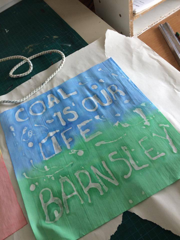
On Thursday 26th May, I continued to generate further sampling within the Textiles studio but also gain inspiration and progression towards my final piece. Within the studio workshop afternoon it consisted of problem solving and planning towards my final piece were I worked backed into my screen-printing samples with a textured process called applique. The development of the technique has allowed me to outline and progress towards my final piece which was a worry and problem faced within the process of generating samples to create a tapestry outline. Also within the studio task I have continued to complete my batik process and work within the surface of the design through textured screen layers to make some pieces unique and connect to the aspect of my theme well. The task has allowed me to progress and combine layers of screen-printing well to the Batik designs to show a sense of justice and graffiti styled outcomes. Also, the task has allowed me to combine sources and show progression and development from previous samples. Within the studio task I have developed further experimental sources through screen layers onto the applique technique it has allowed me to identify an area in which I am wanting to take forward into my design and final development progression. Through the experimental progression and development I have produced screen-print samples onto my previous developed dyed fabrics with the combination of an experimented technique puff binder. The workshop task has allowed me to plan, prepare and organise samples and solutions within the studio to create a final solution and outline towards my final project. Planning and production has been captured through the elements of gaining materials and sources to complete the tasks including my blue card, costing sheet and achieving materials within the fashion studio. The task has allowed me to problem solve practical and theoretical problems within the studio to complete samples to a high standard. The piece has allowed me to plan and prepare through organising my time efficiently within the Textiles studio to achieve the most samples within the time scale given. Finally, the task has allowed me to use development within practical solutions to create a diverse range of samples within Textiles.

To start the task I generated the final outcome of samples for the Batik designs created previously in the week. For the designs to be completed the wax needed to be removed within the surface to complete a clean and smooth finish. This was completed through an iron to remove the excess wax away from the surface which was captured through newsprint. Health and safety was maintained from the technique and hands were placed away from the iron to avoid the risk of burning. Also this was maintained to avoid the iron being in contact with skin. Once the process was completed 3 of my samples generated where taken back into the studio for further development. This amount was selected to show my inspiration and the development within the process and how the element was influential towards my project. To include further aspects of design and the sense of justice the piece was developed with my screen layer taken from the final outcome. I decided to incorporate the design layout of the miner’s face which was repeated across the design to show development and further textured layers. The design was created because it gave a sense of graffiti and a rebellious perspective towards the positive miners’ strike against the government. Also, the design incorporates an industrial perspective with the chosen colour and outline. For the process to work I planned and prepared for the layout through gum strip and newsprint which ensured a blocked outcome. This captured the design well and allowed me to take inspiration previously from my knowledge of creative business cards. For both layers to work it was placed around the writing well and created an overall effective appearance. The designs are demonstrated below. The outcome has been influential and inspirational through the combination of techniques and this element will be contributed further towards my project development. I was pleased with the balance of both themes well within the design outlook. To complete the process, the designs were ironed again to maintain a straight and smooth appearance.
placed under iron


From Previous Design


Samples with iron


Completed Surface Design


Completed Iron Surface
Final Outlook
Next I focused with developing my surface design of dyed fabrics previously created within Textiles. It has given me the opportunity to work with my 4th layer to produce puff binder samples and displays the combination of layers which is my initial idea and outcome towards the project display. The pieces have been reinforced through experimented colour schemes and combined layers displayed within my sketchbook. It has allowed me to work within different surface backgrounds to suit restraints and colour differences with the experimentations. As the colours were faded doing the progression it was seen as a restraint within the project but worked well with my favour because it would capture the surface and foreground designs more effectively. I planned my time efficiently and placed all the background layers onto the design first to be dried and completed for puff binder. The process of puff binder is a substance in which reacts with heat to produce a textured appearance and surface design texture. The piece has been influential as it gives a industrial appearance with the textured grainy and brittle surface. As the material was pleased onto faded fabric it worked effectively as it stood out within the piece and complimenting the design outcome well. The substance was fed through the surface with a squeegee and transferred to the heat gun for progression of the raised surface. Health and safety was maintained throughout the task to ensure the risk of injury. The heat gun was placed away from hands as it would cause damage to the skin with the high continuous raised temperatures. A problem I faced with the heat gun was that the surface caused damaged when in contact with the machine which led to burning and impacting the appearance. To solve the problem with further samples the heat gun was placed away from the design to avoid the risk of burning with developed outcomes. Within the fabric the puff binder worked effectively as it allowed me to express the small intricate details displayed through the surface and the industrial aspect of the design. Through the combination of the textured surface it has complimented the industrial outlines well and effectively. The outcomes are displayed below.
outcomes of both designs

puff binder sample
Puff Binder substance
Puff Binder Development
Puff Binder Surface
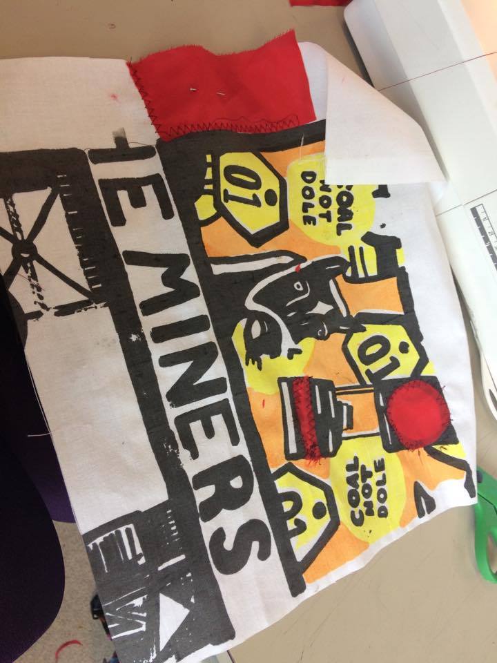
Next I completed an influential workshop task which was the exploration of the sewing machine and process known as applique. The technique is described as “ornamental needlework in which pieces of fabric are sewn or stuck on to a larger piece to form a picture or pattern”. The process has been used previously through the works of Tracy Emin and Grayson Perry within the studied tapestry pieces and I wanted to incorporate this aspect further. It was inspirational to see from the studies of the artists and pieces given within the introduction as it provided a well detailed and crafted piece with a sense of expression and individuality within the surface of the design. The process can be completed through the foreground and background elements of design shown on the example I was given. The exploration of the theme has been very inspiring towards my self-directed project as I felt I struggled to incorporate further design ideas within the surface of the original screen-print banner idea. I felt that my designs were too basic and needed further work within the design which led me to look back into my sketchbook and research to achieve this outcome. I was extremely pleased with this discovery as It gave me the confidence to problem solve and plan ahead within the project to create a final piece with this technique. To explore with the style, I obtained samples previously generated and recycled fabrics achieved within the Textiles studio. Next I captured a diverse range of shapes to cover the designs and create patterns within the surface. Initially I started to develop circular shapes and lines that were placed onto the white and silhouette areas of my design. To ensure the pieces would work they were pinned down and placed through the sewing machine. For my choice of machine I decided to use Husqueverna because it was a suitable machine in which I have gained previous knowledge and understanding off when developed into the surface. For the setting of the design it needed to be planned well because the process of the design needed to include a striking stitch to combine the areas together. At first a running stitch was used which wasn’t successful as it couldn’t rotate well with the continuous lines and forms. Next I focused with the stitch 2 within the husqueverna machine which worked perfectly as It created a striking zig zag form that could be developed and rotated easily. All of the stiches were highlighted and displayed within my technical file. I continued to use this stitch throughout the process and discovered the width of the thread depended on the speed within the foot pedal. This was an important aspect in which I needed to consider when progressing with the design further. Throughout the process black thread was used to capture the bold outlines of the outcome well within the surface of each designs. This was thread up correctly within the machine but problems were faced with my bobbin. Due to the bobbin it caused the machinery to block within some areas of the stitching. To solve the problem, the bobbin was removed and attached a couple of times to achieve the effective outcome and display well. Once the processes were generated, I decided to expand the technique further to create a border around the pieces. This was done by layered fabrics of shapes that were stitched together creating a raised surface around the screen-print design. From observing the piece, it was more effective as it created a balance of the applique process and maintaining the engaging screen-print. From completing the design this gave me further inspiration as the border outline would work well as a sense of division between screen-samples that would be effective to create a tapestry work. As through the works of Tracey Emin she also uses this technique within her tapestry pieces to incorporate and highlight particular areas of the surface design. Also within the studies of Grayson Perry and Tracey Emin I have also captured the sense of nationality and strong display of flags produced within the works. This was influential and connected to the samples of borders well as it gave a sense of pride and unity with the traditional craft being transformed into the piece. As it was also displayed through tapestry banners it contributes to my progression and development well with the technique. This design aspect will be moved forward into the final stage with the chosen technique of applique. The method has been inspiring as it has captured the layouts well and demonstrated a sense of balance between both separate elements. It contributes to the project outcome well and develops a diverse range of practical skills within one piece sampling. Next I am going to explore this aspect further to produce a final outlook of experimentation and sampling. I was extremely pleased with the workshop task as it gave me the drive and determination to produce an initial and effective solution towards the design. It has provided my independence to capture and learn from research to be incorporated into my own style and process. The designs well be inspired from this discovered within the textiles workshop and I will be continuing to produce further samples to demonstrate my understanding and progression effectively.

Chosen Machine
 
Chosen Threads


Applique Samples given in workshop front

back surface of Applique surface given

Attaching Fabric to the design

Developing Border Outcome

Border Outcome design


Experimentation Sample