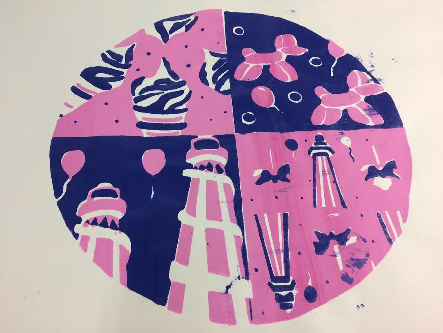
On Thursday 5th of January, I continued to
develop my confidence further within my specialised area “Textiles” through
using the sewing machine to create lettering and patterns. This process has
been developed from my previous experience of working the machine to spell
letters and create patterns easily and efficiently which related back to my
live project brief “Mother & Child”. The task has allowed me to work independently
and solve problems occurred within the sewing machine efficiently and
effectively. Also, the task has allowed me to explore different materials which
all relate back to my interpretation of the theme “Seaside” and “Fairground”.
At first I found completing the task difficult as I was spelling words
incorrectly within the machine but as I gained practise I developed my
confidence to create words that symbolised my theme accurately.
To start the task, I followed health and safety instructions
in order to avoid the risk of injury to me and others when working the machine.
Firstly, I placed all bags away from the machine area to avoid tripping hazards
which was also reinforced when placing the pedal and cables underneath the
table effectively. Next, I placed my mobile phone away from the machines to
avoid distraction when handling the machine, however when I wasn’t using the
machine photos were taken through my mobile phone to capture the task. Sleeves
were rolled up and hair was tied back for the task to avoid the risk of getting
caught within the machine. All of these instructions were followed and
maintained throughout the task.
To create words within the machine, I had to type specific numbers
into the machine to spell each individual letter to create the word I wanted to
achieve. Once the number was obtained I used the pedal to spell the letter out
which was created automatically with the machine. However, a problem I faced
was that I was unsure when the letters were completed which lead to letters
being spelt twice within the surface of the design to create incorrect
spelling. However as I continued to use
the machine I gained the confidence to spell words correctly onto the surface
of the design. All letters placed onto the material, reflects the project and
interpretation of the theme which included the words:
·
Mother
·
Child
·
Circus
·
Fairground
·
Blackpool
These words symbolised my project theme perfectly and I decided
to include the choice of colours which incorporated my theme. For the threads I
decided to use metallic which allowed me to display a variety of bright colours
which related back to my original colour scheme. However, a problem I faced was
that the thread could break easily which was difficult to use on the sewing the
machine. To solve the problem, I used normal thread but still include bright
colours to spell the words I am wanting to achieve. The outcome of my task are
presented below.
 |
| Sewing machine and material Calico |
 |
| Letter outcomes which displays my incorrect spelling |
 |
| Metallic Thread used |
 |
| Final Outcome |
 |
| Final Outcome |